If you have a good brand, a free plan, and a clear reason on why people should sign up. Less sales copy is the way to go. Sales copy and going over all your features on your landing page just creates more distraction.
1. Good Brand – people already know you exist, their co-worker, a friend, or another bigger company talks about you. The person on your website knows you exist they just haven’t gotten around to signing up.
2. Free Plan – no credit card is required, you just need their email address so they can start using your product. If you have a free plan people aren’t interested in reading a bunch of jargon, they just want to kick the tires and see what they can do with it.
3. BIG Clear Reason – yes we know you have tens of thousands of features but really people just sign up for one main reason. As long as you state that main reason in a big bold manner they will give you their email address.
Sales copy gets people lost on your homepage. People usually have 10 tabs open at a time and just don’t want to put the effort in reading every single detail. Remember this rule especially only applies if you have a free plan. If you don’t have a free plan, you need sales copy and lots of it.
Here are some examples of companies that fit the bill.

Evernote has a great brand, free plan, and 1 BIG reason to sign up “Remember Everything”. They have lots of features but they hide everything below the fold and in their “Product” tab. Distraction free signing up!

Stripe has a 3-slides (but they do not automatically rotate) and they focus on getting people to sign up. They tuck away their features on its own page.

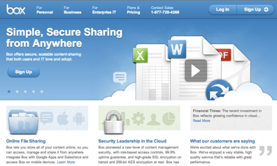
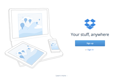
Dropbox and Box both focus on getting people to sign up. Dropbox is way more minimalistic than Box. But notice how they both have clear prominent “Sign Up” buttons and not lot of sales copy.

Social networks do this especially well. Check out Facebook’s sign up page. What is interesting is they don’t offer any images just 3 icons and a form to fill out.
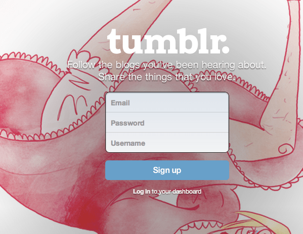
This is Tumblr’s sign up page. Just a big cool image and 3 form fields. What is cool, is if you clicked on the “Tumblr” link on someone else’s blog the background image is actually from the blog you were just on.
So, what is my point here? If you have an online business and you have a free plan. Make your landing page 3 bullet points and a sign up form.
Makes sense!